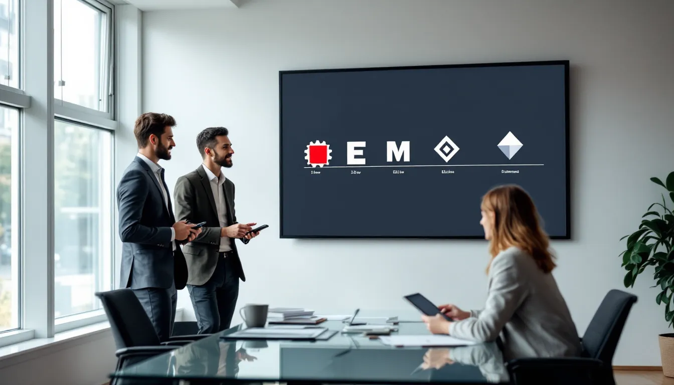
Roblox didn’t just become one of the most recognizable names in gaming overnight. The platform’s visual identity has undergone a fascinating transformation across more than two decades, reflecting shifts in design philosophy, audience demographics, and the company’s ambitions. From a gear-centric emblem in its infancy to the sleek, minimalist tilted square we see today, each logo iteration tells a story about where Roblox was headed, and who it wanted to reach.
For longtime players, the Roblox logo evolution isn’t just a branding exercise. It’s a timeline of memories, controversies, and nostalgia. Whether you’re someone who remembers the iconic red square ‘O’ from the late 2000s or you joined after the 2017 rebrand sparked community debates, understanding these changes offers insight into how one of gaming’s biggest platforms matured from a niche creation tool into a cultural phenomenon with over 200 million monthly active users. Let’s break down every major logo shift, the design decisions behind them, and what they reveal about Roblox’s journey.
Key Takeaways
- The Roblox logo evolution reflects the platform’s transformation from a niche 2004 creation tool with gear-centric imagery to a global gaming phenomenon with over 200 million monthly active users.
- The iconic red square ‘O’ logo (2006-2017) became deeply embedded in gaming culture and represented the platform’s blocky, voxel-based aesthetic, making it nearly impossible to separate from players’ childhood memories.
- The controversial 2017 rebrand to a minimalist tilted square was a strategic decision to scale across mobile, console, and international platforms, prioritizing modern design trends and investor appeal over nostalgic fan loyalty.
- The current tilted square symbol evokes dynamism and creativity while maintaining design flexibility across diverse touchpoints—from app icons to special event adaptations—proving essential to Roblox’s platform expansion strategy.
- Logo changes in Roblox consistently preceded major growth phases: the 2005-2006 refinement aligned with broader user acquisition, the red ‘O’ era supported the creator economy launch, and the 2017 rebrand enabled console and international expansion.
- While generational divides exist between players nostalgic for the old Roblox logo and newer users embracing the modern symbol, the platform’s continued success demonstrates that strategic brand evolution can coexist with audience expansion.
The Birth of Roblox: Understanding the Original 2004 Logo Design
When Roblox officially launched in 2004 (though its beta roots stretch back to 2003 under the name DynaBlocks), the platform needed a logo that communicated its core promise: user-generated worlds built from modular parts. The original design leaned heavily into mechanical imagery, which made perfect sense for a game centered on building and physics.
Why the First Logo Featured a Gear Symbol
The early Roblox logo prominently featured a gear icon, a visual shorthand for construction, engineering, and creation. This wasn’t accidental. Co-founders David Baszucki and Erik Cassel envisioned Roblox as a virtual physics lab where kids could tinker, experiment, and learn through play. The gear symbolized the building blocks (literally) of the platform’s identity.
Unlike polished modern branding, this logo felt rough around the edges. It had an almost industrial vibe, which resonated with the small community of early adopters who were drawn to sandbox-style creativity rather than high-fidelity graphics. The gear sat alongside or integrated with the wordmark, depending on the context, giving the brand a utilitarian, almost educational feel.
Color Palette and Typography Choices in the Early Years
The 2004 logo used a red, blue, and yellow color scheme, primary colors that evoked playfulness and accessibility. The typography was chunky and bold, designed to be readable even at smaller sizes on early 2000s monitors and web browsers. The letterforms had a slight industrial weight to them, reinforcing the mechanical theme.
This color palette also differentiated Roblox from competitors in the early MMO and virtual world space. While platforms like Second Life leaned into sleek, futuristic aesthetics, Roblox embraced a more toy-like, approachable identity. It was branding that said, “This is for kids who want to build, not just consume.”
The 2005-2006 Transition: Refining the Brand Identity
By 2005, Roblox was growing beyond its initial test phase, and the company needed a logo that could scale with its ambitions. The gear-centric design, while meaningful, felt too niche and cluttered for broader marketing efforts. This led to the first major refinement of the visual identity.
Moving Away from the Gear: A More Text-Focused Approach
The 2005-2006 iteration began de-emphasizing the gear symbol in favor of a cleaner, more text-focused wordmark. The gear didn’t disappear entirely, it still appeared in some contexts, but it was no longer the star of the show. Instead, the Roblox name itself became the primary identifier.
This shift reflected a strategic pivot. As the platform attracted more users, Roblox needed a logo that could work across different mediums: website headers, forum avatars, promotional materials, and eventually, merchandise. A gear-heavy logo was harder to reproduce at scale and didn’t lend itself well to varied applications.
The typography remained bold and playful, but the letterforms got slightly more refined. The colors stayed in the red-blue-yellow family, maintaining visual continuity with the 2004 version while signaling a maturation of the brand. For players who joined during this period, this logo is often overshadowed by the more iconic designs that followed, but it was a crucial bridge between Roblox’s scrappy beginnings and its breakout era.
The Iconic Red ‘O’ Era: 2006-2017 Logo That Defined a Generation
If there’s one logo that defines “classic Roblox” for millions of players, it’s the version introduced in 2006 and used until 2017. This design became so deeply embedded in gaming culture that many fans still consider it the “true” Roblox logo, even though being retired for nearly a decade.
Design Elements That Made This Logo Memorable
The 2006 logo introduced several signature elements that would endure for over a decade. The wordmark was rendered in a custom, blocky sans-serif font that felt both modern and approachable. The letters had a slight three-dimensional quality, giving them visual weight without feeling overly complicated.
But the real star of this design was the red square ‘O’, a tilted, solid red block that replaced the traditional letter ‘O’ in the Roblox name. This single design choice became one of the most recognizable elements in gaming branding. It was simple, bold, and perfectly aligned with the platform’s aesthetic of block-based construction.
The rest of the letters were typically rendered in shades of gray or black, which made the red ‘O’ pop even more. This contrast created instant visual hierarchy and made the logo memorable even at a glance. You could shrink it down to favicon size or blow it up on a billboard, and it still worked.
How the Red Square ‘O’ Became Synonymous with Roblox
The tilted red square wasn’t just a design flourish, it became a cultural icon. Players incorporated it into fan art, memes, and even in-game creations. It represented the blocky, voxel-based aesthetic of Roblox itself, where every object, character, and environment was constructed from geometric primitives.
This logo era coincided with Roblox’s explosive growth. Between 2006 and 2017, the platform evolved from a niche sandbox game into a legitimate competitor in the online gaming space. The red ‘O’ was there for every milestone: the introduction of the Robux economy, the launch of mobile apps, major viral games like Jailbreak and Phantom Forces, and the platform’s expansion into social features.
For players who grew up during this period, the logo is inseparable from their memories of the platform. It’s the logo that appeared when they booted up Roblox on Internet Explorer, the icon they clicked on their desktop, and the symbol they saw when trading items or browsing the catalog.
Typography Evolution During This Period
While the red ‘O’ remained constant from 2006 to 2017, the typography surrounding it saw subtle refinements. Early versions of this logo had chunkier, more compressed letterforms. As web design trends shifted toward cleaner, more spacious layouts, the Roblox wordmark followed suit.
By the mid-2010s, the letters had become slightly more refined, less “chunky toy” and more “modern gaming brand.” The three-dimensional shading that gave the letters depth in the early versions was gradually flattened, anticipating the minimalist trends that would define the 2017 rebrand. But through it all, that red square ‘O’ stayed the course, a visual anchor that tied together over a decade of branding.
The Controversial 2017 Rebrand: Minimalism Takes Over
In January 2017, Roblox unveiled a dramatic redesign that shocked the community and sparked one of the most heated branding debates in gaming history. Gone was the beloved red square ‘O’, replaced by a sleek, minimalist tilted square and a sans-serif wordmark that looked like it could belong to a fintech startup. The backlash was immediate and intense.
Why Roblox Chose a Simpler, Modern Design
Roblox’s design team explained the rebrand as necessary for scaling the platform’s identity across an increasingly diverse set of touchpoints. By 2017, Roblox wasn’t just a browser game, it was on iOS, Android, Xbox One, and eventually would expand to PlayStation and VR. The old logo, while iconic, didn’t always translate well to app icons, especially at small sizes where the text became illegible.
The new logo consisted of a tilted square symbol (rotated 45 degrees to form a diamond shape) paired with a clean, lowercase “roblox” wordmark in a modern sans-serif font. The design was intentionally neutral and flexible, capable of working in monochrome, supporting dynamic color schemes, and adapting to different contexts without losing clarity.
According to coverage from IGN at the time, Roblox Corporation framed the rebrand as a maturation of the brand, a signal that the platform was growing beyond its roots as a kids’ game and positioning itself as a serious player in the broader gaming and tech industries. The minimalist aesthetic aligned with design trends popularized by companies like Spotify, Airbnb, and Google, which had all simplified their logos in the preceding years.
Community Reaction and the Backlash Explained
The community’s reaction was swift and overwhelmingly negative. Long-time players felt that the new logo stripped away the personality and nostalgia of the old roblox logo 2017 design. Petitions circulated online demanding Roblox revert to the red ‘O’, with some garnering tens of thousands of signatures.
The complaints fell into a few key categories:
- Loss of Identity: The tilted square felt generic and could belong to any tech company. The red ‘O’ was uniquely Roblox.
- Nostalgia: Players who’d grown up with the platform felt like a piece of their childhood was being erased.
- Corporate Sterility: The new design felt “too clean” and corporate, lacking the playful, scrappy energy that defined early Roblox.
Social media was flooded with memes comparing the roblox logo 2017 to other minimalist rebrands that had been met with similar backlash. Some players even created browser extensions and mods to replace the new logo with the old one on the Roblox website.
Comparing the 2017 Logo to Competitor Brands
When placed side-by-side with competitor gaming platforms, the 2017 Roblox logo looked noticeably more subdued. While brands like Minecraft retained playful, instantly recognizable logos, Roblox’s new identity felt like it was trying to distance itself from being seen as “just a kids’ game.”
Interestingly, this mirrored broader trends in the gaming industry. As platforms like Twitch, Discord, and even mobile game publishers adopted cleaner, more “professional” aesthetics, there was a growing tension between maintaining playful brand identity and signaling maturity to investors and advertisers. Roblox’s 2017 rebrand was a bet that the latter was more important, a bet that, judging by the platform’s continued growth, may have paid off financially even if it alienated some of the core fanbase.
The Tilted Square Symbol: Decoding Roblox’s Current Logo Philosophy
Nearly a decade after the controversial rebrand, the tilted square has become just as iconic as the red ‘O’ it replaced, at least for newer players. But what does this symbol actually represent, and how has Roblox refined its visual identity since 2017?
What the Tilted Square Represents in Gaming Culture
The tilted square (or diamond shape) isn’t just an arbitrary geometric form. It’s meant to evoke the building blocks that define Roblox’s creative ecosystem. By rotating a square 45 degrees, the logo suggests dynamism, creativity, and transformation, the idea that simple shapes can become anything when placed in the hands of creators.
Over time, the symbol has been adopted into the broader visual language of the platform. It appears in UI elements, loading screens, event branding, and even in-game assets. The tilted square has also become a shorthand for “Roblox” in contexts where the full wordmark isn’t practical, app icons, social media profile pictures, and merchandise.
While the initial backlash was fierce, many players who joined after 2017 don’t have the same emotional attachment to the old roblox logo. For them, the tilted square is Roblox. This generational divide in logo preference is a fascinating case study in how branding evolves with audience turnover.
Font Choice and Brand Consistency Across Platforms
The wordmark introduced in 2017 uses a custom sans-serif typeface that’s clean, modern, and highly legible across digital platforms. The lowercase styling was a deliberate choice to make the brand feel more approachable and less “shouty” than all-caps alternatives.
Since the rebrand, Roblox has maintained tight consistency in how the logo is applied. Whether you’re viewing it on a mobile app icon, a website header, or promotional materials, the proportions, spacing, and color usage remain uniform. This level of brand discipline is a stark contrast to the more ad-hoc approach of the early years, where logo variations proliferated across different contexts.
The primary color for the tilted square is typically black or white, depending on the background, though Roblox occasionally uses color variations for special events or seasonal promotions. This flexibility was one of the key goals of the 2017 redesign, and it’s proven valuable as the platform has expanded into new markets and product categories.
Logo Variations Across Different Roblox Platforms and Products
One of the underappreciated aspects of the Roblox logo evolution is how the design adapts across the platform’s sprawling ecosystem. From mobile apps to VR experiences, each context requires subtle variations to maintain both brand consistency and functional clarity.
Mobile App Icon vs. Desktop Branding
On mobile platforms, the Roblox logo typically appears as just the tilted square symbol without the wordmark. This is standard practice for app icons, where space is limited and text often becomes illegible at small sizes. The square’s bold, simple shape ensures it stands out on crowded home screens alongside other gaming apps.
On desktop and web platforms, the full wordmark is more commonly used. The Roblox website header, login screens, and promotional banners feature the complete logo with both the symbol and text. This creates a hierarchy: the symbol functions as a shorthand identifier, while the wordmark provides full brand clarity in contexts where space allows.
Interestingly, Roblox has experimented with variations where the tilted square appears in different colors or with gradient effects, particularly for promotional materials tied to specific updates or events. These variations maintain the core geometry while allowing for creative expression that keeps the brand feeling fresh.
Special Event and Seasonal Logo Adaptations
Roblox has embraced temporary logo modifications for major in-platform events, holidays, and partnerships. During Halloween, the tilted square might incorporate orange and black color schemes. For holiday events, it could be adorned with snow or festive elements. These adaptations are always subtle, modifying color, adding small decorative elements, or adjusting the background, while preserving the core symbol’s recognizability.
This approach mirrors tactics used by gaming platforms like Polygon has covered in their design features, where brands balance consistency with timely relevance. Special event logos generate buzz on social media, create a sense of occasion, and give the brand a dynamic, living quality that static logos lack.
Roblox has also created custom logo variations for major partnerships and collaborations. When the platform hosts brand experiences from companies like Nike, Chipotle, or entertainment properties, there’s often co-branding that integrates Roblox’s tilted square with the partner’s visual identity. These collaborations require a flexible design system, something the 2017 logo was specifically built to accommodate.
What Roblox’s Logo Evolution Teaches Us About Gaming Brand Strategy
The Roblox logo evolution isn’t just a design history lesson, it’s a masterclass in how gaming brands navigate growth, audience shifts, and platform expansion. The decisions Roblox made about its visual identity reveal broader truths about branding in the gaming industry.
Balancing Nostalgia with Modern Design Trends
One of the thorniest challenges for any long-running platform is how to honor its history while staying relevant to new audiences. The roblox logo old designs carry immense nostalgic weight for players who grew up with the platform, but clinging too tightly to retro aesthetics can make a brand feel dated.
Roblox chose modernization over nostalgia with its 2017 rebrand, a decision that alienated some longtime users but positioned the platform for mainstream growth. By 2026, Roblox boasts over 70 million daily active users and has secured partnerships with major brands, educational institutions, and entertainment companies. Would this level of success have been possible with the red ‘O’ logo? It’s impossible to say, but the rebrand signaled to potential partners that Roblox was serious about evolving beyond its roots.
Other gaming platforms have handled this balance differently. Minecraft, for instance, has maintained a consistent visual identity for over a decade, leaning heavily into the nostalgia and recognition its logo commands. The difference may lie in target demographics: Minecraft’s brand is inseparable from its retro, indie origins, while Roblox has always positioned itself as a platform first and a game second.
How Logo Changes Reflect Platform Growth and Audience Expansion
Each major logo iteration coincided with a significant expansion in Roblox’s capabilities or audience reach. The 2005-2006 refinement came as the platform moved out of beta and pursued broader user acquisition. The 2006 red ‘O’ logo arrived as Roblox introduced its economy and began building the infrastructure for user-generated content at scale. The 2017 rebrand preceded the platform’s explosive growth into mobile gaming, console support, and international markets.
As Video Games Chronicle has documented in their industry analysis, logo changes are rarely arbitrary, they’re strategic signals about where a company is headed. Roblox’s evolution from gear-centric to text-focused to minimal geometric design mirrors its journey from niche physics sandbox to creator economy powerhouse.
The logo evolution also reflects Roblox’s shifting self-perception. Early designs emphasized creation and engineering. The red ‘O’ era balanced playfulness with functionality. The current tilted square suggests something more abstract and aspirational, a platform for any kind of experience, not just block-based building.
For players interested in exploring the platform’s features or understanding how Roblox’s economy has evolved, these branding shifts provide context for how the company views its own identity and future.
Conclusion
The Roblox logo evolution is more than a series of design updates, it’s a visual timeline of one of gaming’s most remarkable success stories. From the gear-driven identity of 2004 to the controversial minimalism of 2017 and the refined tilted square of today, each iteration reflects strategic decisions about audience, platform capabilities, and brand positioning.
Whether you’re nostalgic for the roblox logo 2017 or have embraced the modern diamond symbol, understanding this evolution offers valuable insight into how gaming brands mature alongside their communities. As Roblox continues to expand into new technologies, markets, and creative territories, its logo will undoubtedly continue to adapt, proving that in gaming, as in design, evolution is the only constant.